
A branded enterprise AI design system from a few simple choices.
What if you could turn a brand’s style guide into a complete design system in a dozen choices, then wear it three different ways?
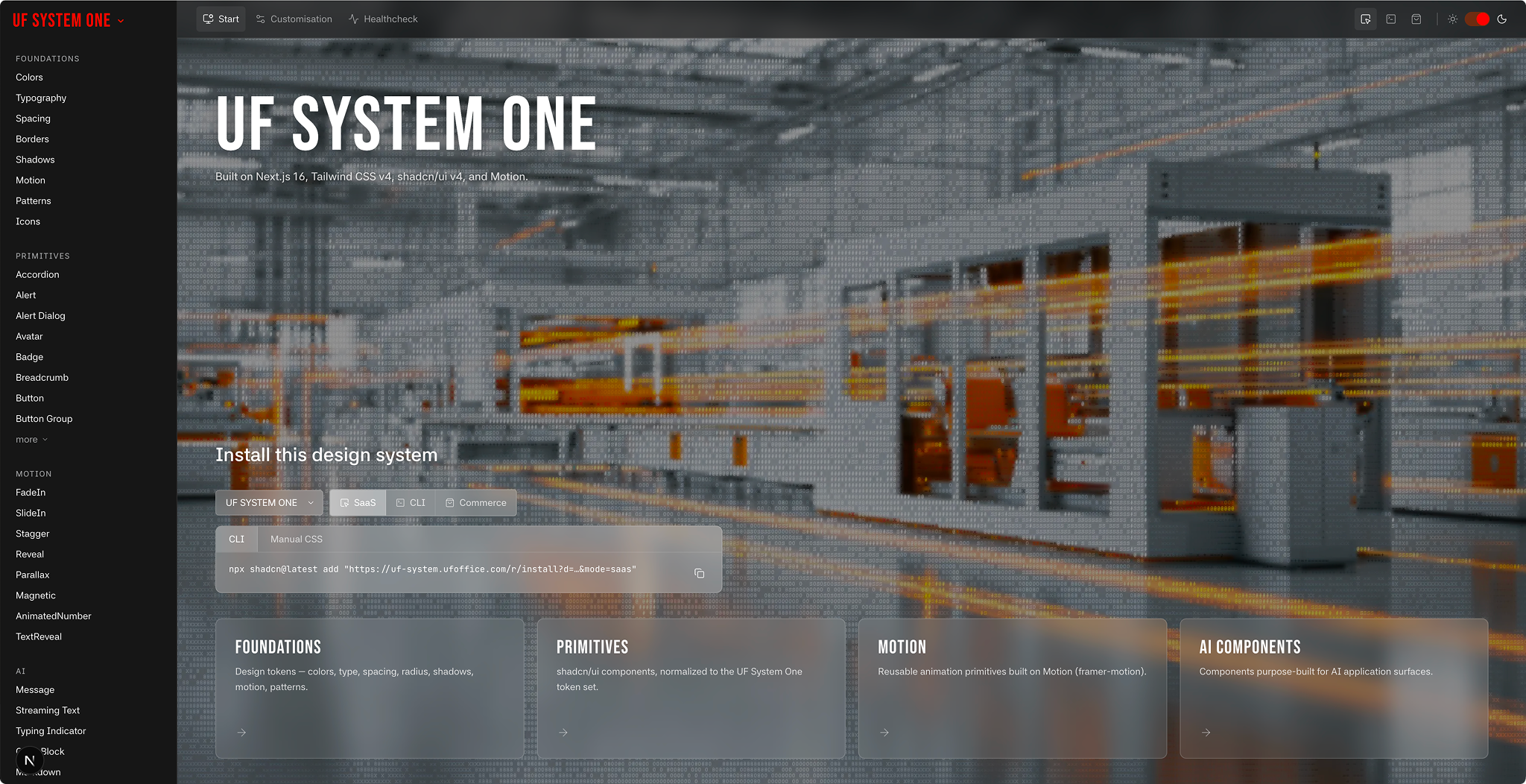
I built UF System to prototype and ship AI products fast. When a client hires me, the clock starts, and I would rather spend those early hours on what makes their product theirs than rebuild the same fifty components, in two themes, for every new engagement. So I built my own foundation to reach for at the start of any project. It wasn’t something I set out to sell.
UF System is a design-system generator. You set a small number of parameters and it produces a coherent system across every component, in both light and dark. It is not a brand system. It is an enterprise design system built from a brand’s style guide. Those are different things: a style guide tells you what a brand looks like, and a design system is what you build product on.
The idea it all rests on is a separation most systems never make. What a system is, its colours and fonts and spacing, usually comes tangled up with how it looks, its density and corners and weight. I pulled them apart. The two are fully independent, which is what makes everything else possible.
Customising it takes about a dozen decisions. You choose the semantic colours for light and dark. You pick one brand colour as a neutral tint, and it re-tints the entire greyscale from there. You set the typography, the spacing, the icons.
Every system carries light and dark. On top of that, UF System renders in three modes. They share the system’s colours and fonts but change its entire visual language. The mode and the system are independent: switch one and the other doesn’t move.
3 different modes
SaaS is the balanced default, the UI style most SaaS applications reach for. Clean and minimal, comfortable for dashboards and admin tools, the register you want when someone is going to live in the screen all day.
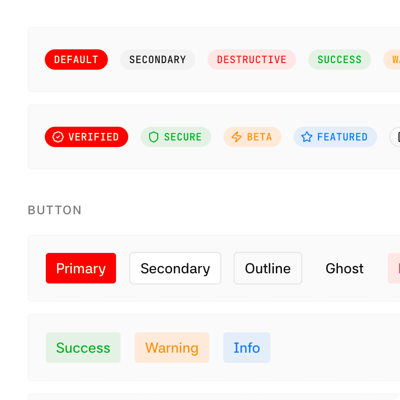
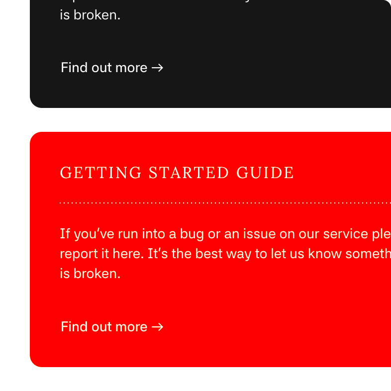
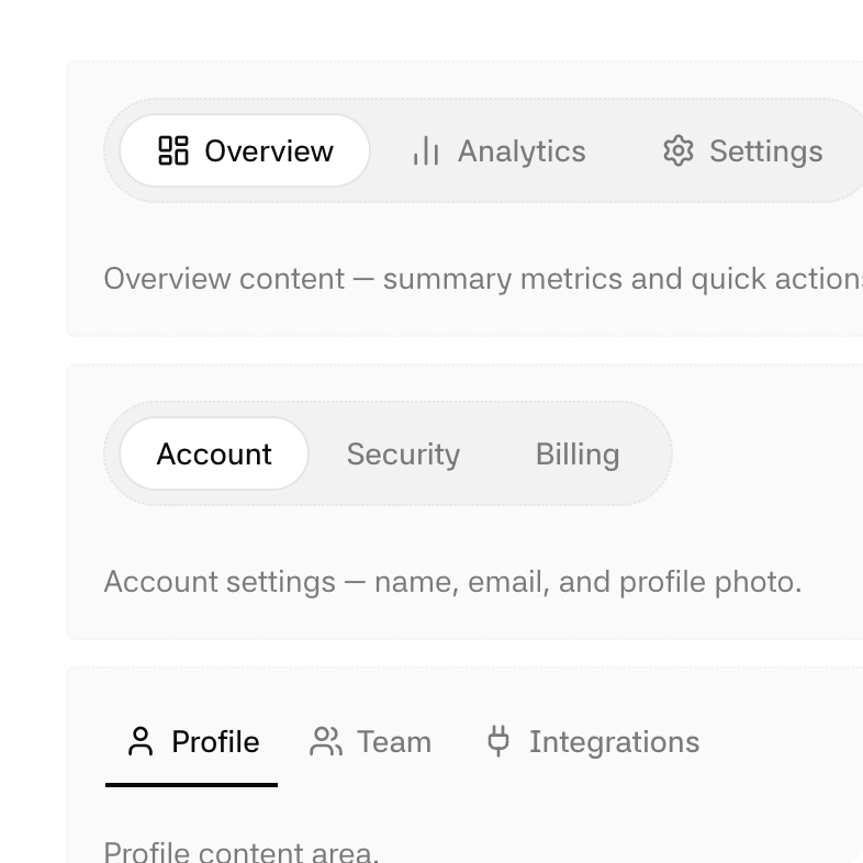
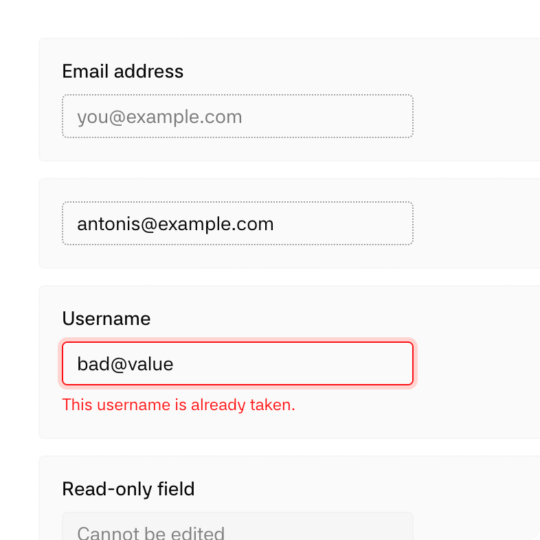
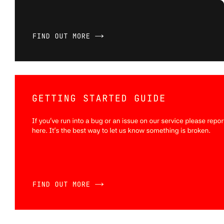
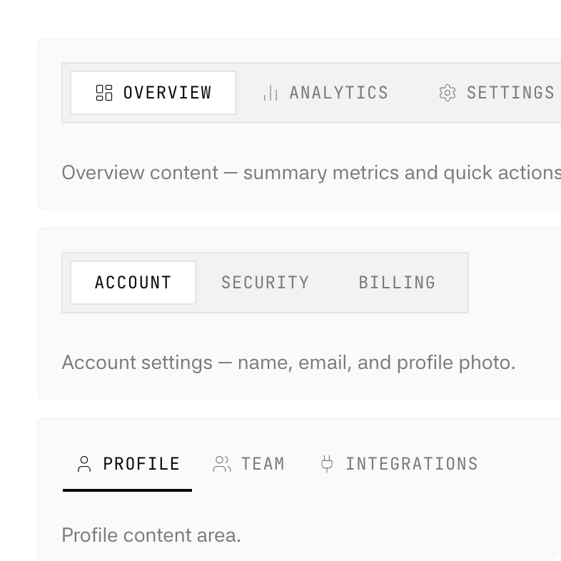
CLI is the terminal register, the look agentic tools tend to wear. Monospace leads, the type runs small, the weights stay slim, the padding pulls tight, the corners square off. Everything reads as precise and close to the machine.
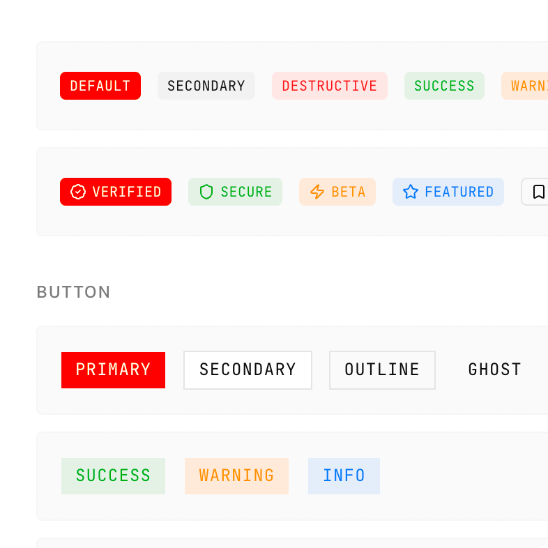
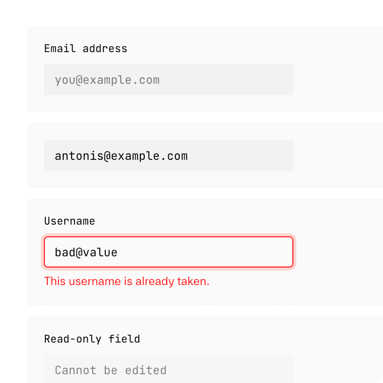
Commerce is the storefront register, the polish you see in editorial and e-commerce. Type runs large with a wider scale, corners round off, spacing opens up, and real depth and elevation give the surfaces a tactile feel you want to reach out and touch.
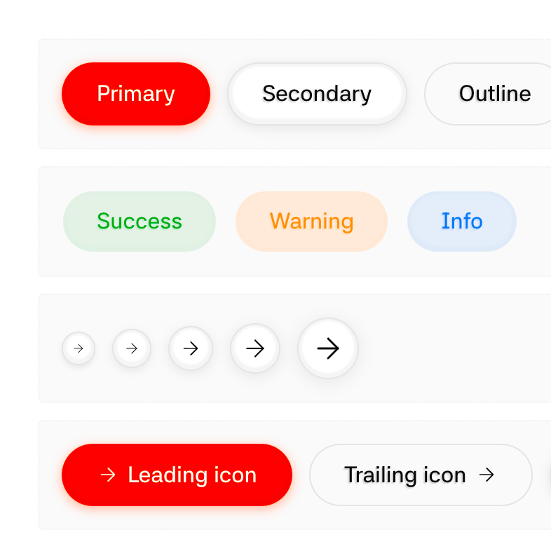
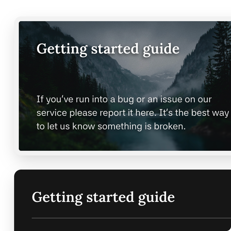
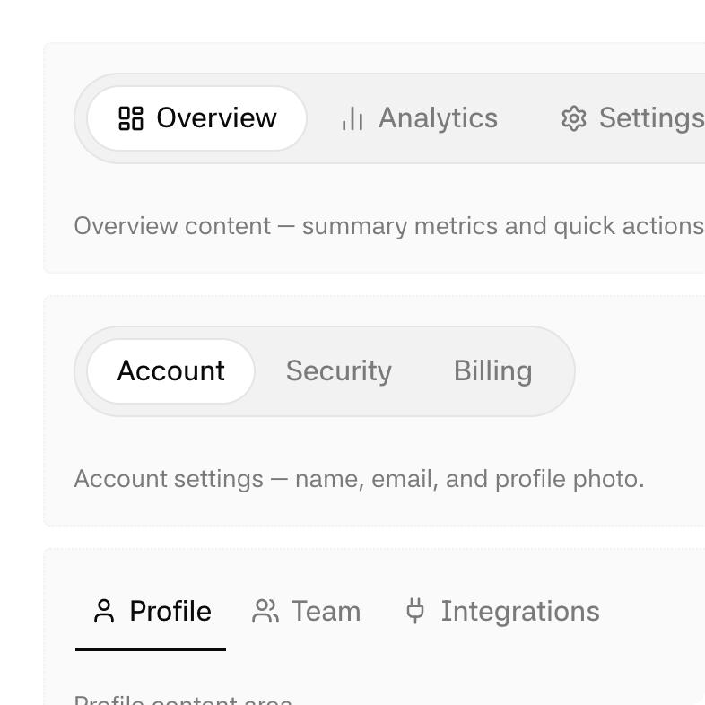
A few AI components
Under the hood
The discipline that makes everything else work is one rule: no hard-coded colours anywhere. Every value resolves to a single central token file, and that rule is what lets a system be re-themed and re-moded at will.
The stack is Next.js on the App Router, with React and TypeScript in strict mode. Styling runs on Tailwind over a CSS-variable token system, with shadcn/ui primitives you own and edit directly. A dedicated motion layer handles animation, and dark mode is class-based with dark as the canonical default.
It documents itself. Every component, motion primitive, and foundation gets its own page. Hover a token and you see its live value, a swatch, and everywhere else that shares it, so you know what a change will touch before you make it.
Installing a system works three ways: start a new project from the whole repository as a template, run a single command that installs one branded, mode-specific theme with your mode baked in as the default, or drop in a raw CSS copy.
Reflections
UF System does work. I’ve generated several systems with it and run them on real projects, and they’ve fitted properly every time, not “good enough to ship” but right. That’s the part I wasn’t sure of until I had done it a few times.
What I want to play with next is making generation simpler still. There’s something in Google’s design.md methodology worth borrowing, though I’d keep it tighter and aimed squarely at the UI. The version I’m after is almost greedy: upload a single button, or one input field carrying your brand’s primary colour, and get a whole design system back. One component in, the system inferred from it. That’s the direction.